What’s covered:
- What is the app’s UI/UX localization?
- 3 pillars of UI/UX localization
- 7 best practices for effective app UI/UX localization
- What to look for in a localization management tool
- Frequently asked questions
- Expand your reach with effective UI/UX localization
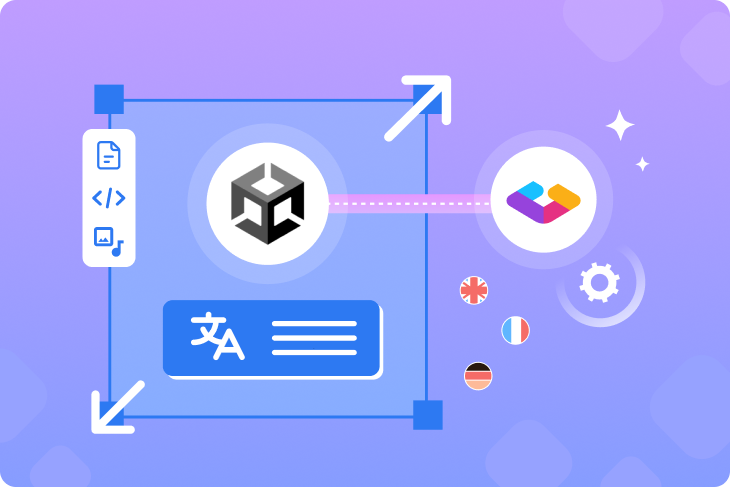
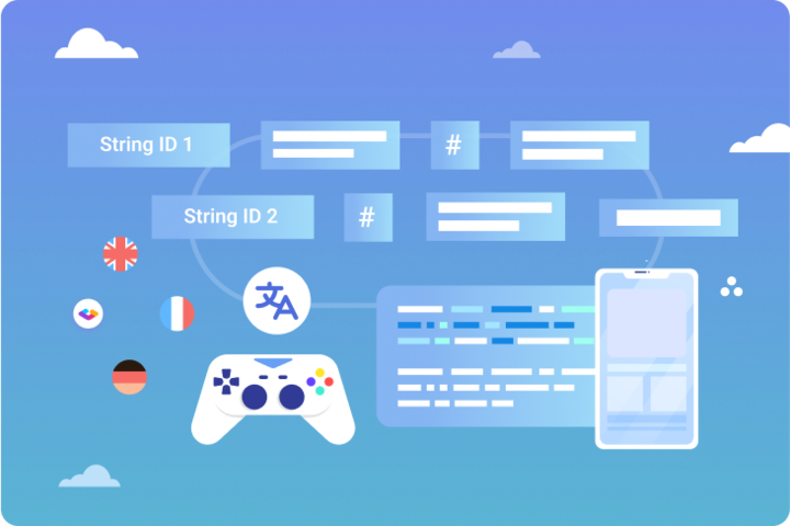
When you’re planning to expand your app’s global reach, you need to devise a viable localization strategy. App localization, which means not only translating the content but adapting it to local cultures, will define your product’s growth in different regions.
Regardless of the niche your application caters to or the platforms it supports, you need to thoroughly localize its UI/UX to ensure a native-like feel, cultural relevance, and linguistic consistency. What does this process entail and what to pay particular attention to?
In this post, we’ll go through the best practices of localizing your app’s UI and UX to help ensure that all versions function properly and meet local expectations. Before we dive into the dos and don’ts, let’s see what UI/UX localization means and why it plays an essential role in your app’s success.
What is the app’s UI/UX localization?
Localization of the app’s UI means translating all interface elements into a target language, while localizing the UX means adapting the whole experience of using the app to fit cultural preferences, language-specific formats, and other local nuances.
NB!: The three things to distinguish here are usability, interface, and user experience:
- Usability corresponds to the ease of achieving a specific goal in the app. In this context, your app should be error-free and users should naturally understand how to perform certain actions within it.
- User interface includes all the visual and interactive (touchable, scrollable, etc.) elements. Not only UI copy and button sizes are important here but the whole screen layout and negative space between elements.
- User experience encompasses a general perception of the app. Good user experience is a result of impeccable usability and well-thought interfaces.
UI/UX localization doesn’t simply end up with translating separate strings of text. Sometimes, it implies rethinking the interface layout or navigational logic. Ultimately, it means tailoring the experience to specific usage habits and local conventions, which may relate to language directionality, cultural perception of certain icons or colors, commonly used date or currency formats, and so on.

Why is it crucial to localize your app’s UI/UX?
So, why should you go to great lengths to localize your app to multiple languages? Here’s what localization will help you achieve:
- Paving the way for global growth. At the end of the day, localized versions of an app mean reaching a wider audience and gaining more streams of revenue. There’s a limit to what you can achieve with a single locale, and entering new markets is a sureproof way to grow.
- Boosting customer satisfaction. Multiple studies show that culturally preferred design elements improve usability. When the look and feel of an app caters to individual cultural backgrounds, it has a higher chance of satisfying and retaining users.
- Increasing engagement and conversions. According to the 2020 CSA research “Can’t Read Won’t Buy” for each locale.
- Complying with regulations. Sometimes, it might be legally required to provide local language options when launching an app in certain countries. Don’t overlook this aspect when researching target markets and planning the localization.
In any case, you should understand what countries you want to expand to and analyze their markets prior to translation. See if your app can provide value to local users and what culturally specific expectations they might have.
3 pillars of UI/UX localization
 There are many practical tips that will help you localize the app’s UI/UX, but for the most sustainable and resource-efficient process, you might want to integrate localization into your product development as early as possible.
The 3 pillars on which effective app localization rests are design-led workflow, UI/UX writing with different audiences in mind, and a continuous approach to translations.
1. Design-led localization. Integrating translation efforts into the design stage will save you time and money, as the localization team will be familiarized with all interface elements and changes as soon as they appear, while the design team will be able to seamlessly view and test multiple versions in different languages.
With Gridly’s Figma localization plugin, you can effortlessly sync your designs in Figma with localizations. You can create a UI/UX design in Figma and then easily push it to Gridly to get the copy translated. By syncing with Figma, you can easily track all changes and quickly test how designs look in different languages.
On top of that, our latest update allows you to:
- Instantly push text from selected layers in Figma to Gridly
- Generate screenshots of synced objects and store them in Gridly
- Group duplicated source texts to save time on translation

2. UI/UX writing done with the localization in mind. When you consider potential translations from the get-go, it will be easier to adapt the copy to different regions. This means creating a glossary to have unified terminology, avoiding ambiguity and colloquial language, and creating a generally concise and simple copy. If your app does feature some humor or slang and it’s part of your brand, don’t remove it from the original language but create more neutral versions or explainer notes for translators to be stored somewhere for future localizations.
3. Continuous localization. With any digital product, you’ll never have a final version—your app will be continuously updated, which should always be reflected in translations. With a continuous approach to localization, you can keep track of the process without having to launch a separate translation cycle every time there’s a minor change released. Instead, you’ll have your codebase, design systems, and translations connected so that the localization team gets immediately notified about the change, can see and understand the context, and implement translations. To make this possible, use a translation management platform that supports continuous localization.
>> Learn more about continuous localization
If you already have a developed product and you haven’t localized it from the early stages, it doesn’t mean that you can’t sync translations with designs. All you need is the right localization management tool.
Now that it’s clear that it’s best to use a continuous and design-led approach, let’s discover the 7 proven practices that will make your localization process easier and the result more successful.
7 best practices for effective app UI/UX localization
What should you be aware of before hiring translators and launching the localization process? We’ll talk about the 7 crucial aspects of UI/UX localization that you’ll have to deal with.
1. Leave room for longer text fields
If your original language is English, it is comparatively concise. In some other languages, even the simplest fields like “user” or “log in” may include a lot more words and characters. For instance, the phrase “start free trial,” which is a very common UI copy for CTA buttons in apps, will grow from 16 characters in English to 28 in Portuguese (“começar a avaliação gratuita”).
As a rule of thumb, your layouts should allow for twice as long phrases and all text fields and buttons should be designed with the longer copy in mind. Some platforms even have their own tools for testing the UI copy with double-length pseudo-languages—for example, this option is available in Xcode for iOS app localization. (Pseudo-languages means automatically generated phrases of a certain length that help visualize layout issues.)
Here’s an example of buttons of different lengths in English and Dutch where the design is originally made with potential expansion in mind and is automatically adjusted for the length:

Automatically adjusted UI elements for longer text fields. Source: Canva
2. Make sure all characters are supported
It’s also important to pay attention to font sizes and line heights (the distance between the lines of text) to make sure that words in all languages are displayed correctly (especially if you’re localizing to logographic languages).
Here are some other rules to follow when it comes to choosing fonts and translating textual fields:
- Don’t split strings or provide context if you do. If you split a text string for specific design purposes and parts of a phrase are separated, it’s essential to provide the context for translators. For this, your translation management tool should support adding notes and screenshots.
In Gridly, you can upload files of any type and arrange them by categories or assign an individual file to each record so that translators can learn the context where a certain string is used.
- Use proper encoding. For your app to display all characters correctly, you need to use UTF-8 (for European languages) or UTF-16 encoding (for Asian languages).
- Don’t hardcore any text. Hardcoded strings are generally bad as they don’t allow for flexible changes. You need to have all UI/UX copy easily extractable by a translation management tool.
3. Make user input forms culturally inclusive
There are many stories of frustration that resulted from culturally insensitive name input fields when apps and websites marked last names invalid. Those names were inputted with special characters, started from a lowercase letter, or contained only 2-3 characters.
Make sure that everything that a user has to input corresponds to local norms and conventions. Regarding names, there are many variations of using the first name and the family name, and the format of split fields like “first name” and “last name” doesn’t fit all cultures. It’s better to use a single field instead of multiple ones.

User input form error. Source: Reddit
4. Adjust the layout for RTL languages
If you’re localizing an app to right-to-left languages like Arabic, there are some cultural conventions related to the interface and navigation. People speaking these languages have a different perception of layouts—for instance, they will expect to see menus on the left.
Here’s an example of right-to-left orientation on the Airbnb website (the layout looks inverted to left-to-right language speakers):

Airbnb in Arabic. Source: Airbnb
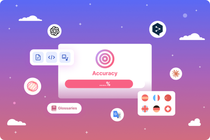
5. Use appropriate formats
There are many commonly used elements—dates, currencies, units, phone numbers, addresses, etc.—that have a different format based on a locale. Even the tiniest details like decimals and thousand separators play their role in the perception of content.
Consider these details to format your app’s copy correctly. There are many helpful tools that automate consistent usage of local formats—for instance, Date.js for time formats in web applications.
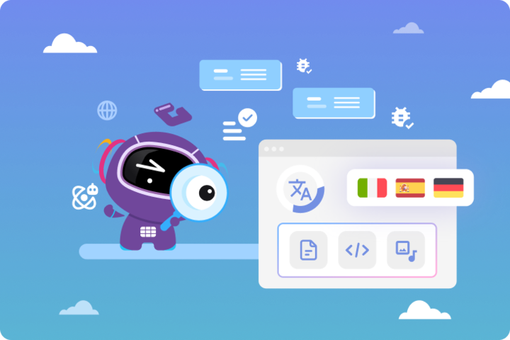
6. Localize non-textual elements
While textual copy will be at the core of your localization processes, it’s also important to examine non-textual elements of the UI/UX. They can include icons, illustrations, promotional photos, animations, etc. Sometimes, it even makes sense to rethink the color palette Local-specific compliance badges, awards, and external links are also part of non-textual elements that you should add to your localization agenda.
As a basic thing, it always makes sense to design the first screen of your app with local offers and local images to be more relevant. See, for example, how Shopify uses different visuals and layouts on their main page in English and Japanese:

Different layouts and visuals for local versions of the main page. Source: Shopify
7. Design the app for locales instead of languages
If you target multiple regions that speak the same language, you might want to adapt your app to each region. For instance, a French version for France and Canada should include a different currency. Plus, it’s better to tailor notifications to each time zone and craft special offers with regard to local culture, events, stars, etc.

Multiple locales in the same language. Source: Canva
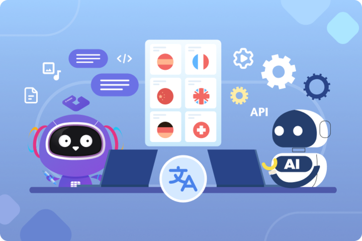
Gridly supports more that 200 locales and 70 languages so you can easily create local versions for multiple countries and regions.
This list of tips is not exhaustive but these are the major aspects to be aware of when localizing your apps. As we’ve mentioned, the choice of a localization system will largely define the success of your localization project. You’ll need to find a tool that not only allows for flexible string translation but includes features that make translations easier. Let’s explore what are the most helpful features to look for.
What to look for in a localization management tool

A good platform should reduce manual efforts and serve you as a single point of truth for all the translation-related work. The must-have features of a translation management tool include the following:
- Design integrations. As it’s important to have a seamless sync between designs and translations, search for a platform that supports integrations with design tools your team is using.
With Gridly’s Figma plugin, you can easily review all UI translations in one place and adjust the layouts so that all text fields and buttons remain consistent in every language.
-
Collaborative environment. It should be easy for everyone involved in the localization process to communicate with each other and track the progress of their work. Search for the tool that supports setting different access levels (for translators, reviewers, etc.) and allows adding multimedia for context. Also, see if there are integrations with the communication tools you’re using—for instance, automated messages about new translations sent to Slack.
-
Translation memory. Translation memory stores your translations so that you can have unified terminology and automatically prefilled translations for similar fields.
-
Automation capabilities. Automated workflows can help you improve the localization process by eliminating extra manual steps. Search for translation management platforms that feature automated workflows and AI-powered automation for importing and exporting content, sending notifications and assigning tasks, prefilling translations, etc.
-
Continuous localization. Following the continuous approach to localization means updating translations as soon as any new content element appears. You don’t have to wait for a fully released updated version of your product to launch a separate cycle of localization—translate the app continuously. This way, translator s will always be on track with what has changed in the app’s functionality or design and won’t waste time on familiarizing with each new version.
-
Localization testing. Testing is an inevitable part of localization, and it makes sense to adopt a tool that includes quality assurance functionality.
With Gridly’s localization QA capabilities, you can easily categorize different issues and track your progress in translating the game’s UI.

Frequently asked questions
Frequently asked questions
What is UI/UX localization for apps?
UI/UX localization for apps is the process of adapting both the visual interface and the overall user experience of an application for different languages, cultures, and regional markets. Localizing the UI means translating all interface elements — buttons, labels, menus, error messages — into a target language. Localizing the UX means adapting the broader experience: layout direction, cultural conventions around iconography and color, locale-specific date and currency formats, and navigation patterns that match local usage habits. Done properly, a localized app feels natively built for its target market rather than translated from somewhere else.
What is the difference between usability, UI, and UX in the context of app localization?
These three concepts are related but distinct. Usability refers to how easily users can achieve specific goals within the app — a localized app should be error-free and navigation should feel intuitive to local users, not just functional. User interface covers all the visual and interactive elements of the screen: button sizes, layout, spacing, and copy. User experience encompasses the overall perception of using the app — the combined result of good usability and well-considered interfaces. Localization touches all three: a poorly localized UI creates usability barriers, and usability problems directly damage the user experience, even when the translation of individual strings is technically accurate.
Why should app teams invest in localizing UI and UX rather than just translating the content?
Studies show that culturally preferred design elements improve usability — when an app’s look, feel, and navigation align with a user’s cultural expectations, they engage more and stay longer. CSA Research found that users are significantly more likely to convert and spend money in apps that feel native to their region. Beyond engagement, regulatory compliance is increasingly a factor: some markets legally require local language options. And practically, a localized UI is far easier to scale — once layouts are built to accommodate text expansion, adding new languages involves far less rework than retrofitting a UI designed only for English.
What are the three pillars of effective app UI/UX localization?
The first is design-led localization — integrating translation into the design stage from the start, so the localization team sees all interface elements and changes as they appear and designers can immediately test how layouts look in multiple languages. The second is UI/UX writing with localization in mind — creating copy that is concise, unambiguous, and free of culture-specific idioms in the source language, with a glossary to standardize terminology across all target languages. The third is continuous localization — keeping translations synchronized with the constantly evolving product rather than launching separate translation cycles for each release, which ensures translators are always working from the current version and no strings are missed.
How much text expansion should app UI designs account for?
As a general rule, layouts should allow for text fields that are up to twice as long as the English source. A concise English CTA like “start free trial” — 16 characters — becomes 28 characters in Portuguese. European languages consistently require 20–40% more space than English for equivalent phrases, and the difference is most pronounced in short UI strings like button labels where a single word may expand significantly. Designing UI elements with dynamic, auto-expanding containers from the start prevents the truncation and overflow issues that appear when fixed-width designs meet longer translations. Pseudo-language testing tools — such as those built into Xcode for iOS — simulate double-length strings and help surface layout problems before real translations are applied.
How should teams make user input forms culturally inclusive?
The most common failure point is name fields structured around Western naming conventions — separate “first name” and “last name” fields with validation that rejects special characters, short names, or names starting with lowercase letters. Many cultures use a single name, reverse the order of given and family names, include special characters as part of standard spelling, or use names with only two or three characters. A single free-form name field handles this far more reliably than split fields with format enforcement. Beyond names, address formats, phone number structures, and postal code patterns all differ by region — form validation rules built for one locale should never be applied globally without review.
What does adapting an app for right-to-left languages involve?
RTL adaptation goes well beyond flipping text alignment. The entire spatial logic of the interface needs to be mirrored: navigation menus that appear on the right for LTR users belong on the left for Arabic and Hebrew speakers, who expect the primary navigation anchor to follow their natural reading direction. Progress bars, carousels, and swipe gestures should reverse direction. Tab orders, list hierarchies, and icon placement relative to text labels all need to be reconsidered. The Airbnb Arabic site is a well-known example of this done correctly — the layout appears fully inverted to LTR users because it has been genuinely adapted, not just text-flipped. RTL support built into the app framework from the beginning is significantly easier to maintain than retrofitting it after launch.
Why should teams design for locales rather than just languages?
Language is a subset of locale — two regions speaking the same language may have meaningfully different expectations around currency, date formats, cultural references, seasonal events, and regional regulations. French for France and French for Canada require different currency symbols, different date formats, and ideally different local references in marketing content and notifications. Spanish for Spain and Spanish for Mexico diverge in vocabulary, formality conventions, and cultural touchpoints. Designing for individual locales rather than language codes ensures that currency, time zone, promotional content, and even imagery are appropriate for each specific market — not just the broadest version of that language.
What should teams look for in a localization management tool for app UI/UX?
Six capabilities define a tool suited for continuous app UI/UX localization. Design integration — particularly a Figma plugin — allows translations to be previewed inside actual designs rather than in isolation, making layout problems visible before engineering picks up the file. A collaborative environment with role-based access ensures translators, reviewers, and project managers each have appropriate visibility and editing rights. Translation memory stores approved translations for reuse across repeated UI strings, enforcing terminology consistency. Automation capabilities handle routine tasks — content import and export, task assignment, progress notifications — without manual intervention. Support for continuous localization connects the codebase and design system to the translation workflow so translators are notified of changes immediately. Integrated localization QA tools allow issues to be categorized, tracked, and resolved within the same platform rather than managed separately.
How do you handle non-textual elements in app localization?
Non-textual elements — icons, illustrations, promotional images, animations, color schemes, and external links — require as much attention as copy in a thorough localization effort. Icons that carry clear meaning in one culture may be ambiguous or offensive in another. Colors carry different cultural associations by region: white is associated with mourning in parts of East Asia, while green carries different religious significance in some Middle Eastern markets. Promotional imagery should feature locally relevant visuals rather than images created for the original market. Compliance badges, app store ratings references, and external links may need to be swapped for regional equivalents. The most visible example of this done well is Shopify’s Japanese homepage, which uses a substantially different layout and imagery from its English version — a deliberate regional adaptation rather than a translated copy.
How does Gridly support app UI/UX localization workflows?
Gridly supports continuous, design-integrated app localization through several connected capabilities. A Figma plugin syncs UI designs directly with Gridly, allowing text to be pushed from selected design layers into the translation workflow and screenshots to be generated and stored automatically alongside each string — giving translators visual context without switching tools. Translation memory ensures that repeated UI strings like navigation labels and standard button copy are reused consistently across screens and releases. Role-based access controls allow translators, reviewers, and localization managers to collaborate within the same platform with appropriate permissions. Automation handles notifications, task assignments, and content routing without manual coordination. Gridly supports more than 200 locales and 70 languages, making locale-level differentiation — separate versions for France and Canada, or Spain and Mexico — straightforward to manage within a single project structure.
Expand your reach with effective UI/UX localization
To build a robust UI/UX localization strategy for your application, we recommend opting for continuous localization and adopting a suitable translation management tool for controlling the process.
To make sure all language versions are culturally relevant and linguistically correct,
- research each target market to learn about regulations, sensitivities, norms, and c onventions;
- design all fields with a longer copy in mind;
- localize both textual and non-textual elements of your app;
- adapt the layout when it’s needed to fit local expectations.
If you’re looking for a localization tool that adapts to your needs, sign up for Gridly and claim your 14-day free trial today.